Our Pride Logo: The meaning behind the brand
Those of you who followed our re-brand back in 2019 will know that our values were born out of weeks of in-depth workshops with staff, trustees and clients from across the Connected Voice family of services. It was important that we worked together to agree ‘who we are’ and what beliefs we share. We are proud of our values. They are honest and real, and truly represent what we are striving to achieve as an organisation.
Worldwide, June is LGBT+ Pride Month - although locally, Northern Pride takes place in July - and we think it’s a great time to reflect on these values and in particular:
We champion equality.
We believe that diversity should be celebrated and valued, and everyone deserves equality.
Working towards a fairer future for all, we won’t stand still. By making an impact on causes big and small, we want to improve the quality of life across the region.
In the coming weeks we’re sharing a series of blogs about the work we do across Connected Voice to support LGBT+ individuals, communities, and VCSE organisations. We’re starting with a blog from LGBT+ Northern Social Group.
We’re also excited to unveil a special Pride Month logo to accompany the blogs and draw attention to our services that are here to support LGBT+ people and communities in a variety of ways, whether it’s championing the rights of individuals through our Advocacy services, supporting LGBT+ organisations to be more successful with the help of our Support and Development team, or understanding the complexities of intersectionality that impact the work of Haref in tackling health inequalities in ethnic minority communities.
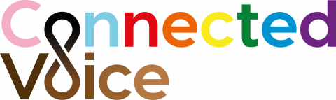
Most people are familiar with the traditional Pride Flag created by Gilbert Baker, although may not be aware of the meaning behind the different colours. In fact, the original flag had eight colours:
- Hot pink = Sex
- Red = Life
- Orange = Healing
- Yellow = Sunlight
- Green = Nature
- Turquoise = Magic/Art
- Indigo = Serenity
- Violet = Spirit
The pink and turquoise colours were dropped in 1979 to leave the six colour flag that many of us recognise today.
A strong brand has the flexibility to grow and adapt. In Philadelphia, the colours black and brown were added to highlight that people of colour are often not fully included in LGBT+ communities. Taking this design a step further, Daniel Quasar created a Progress Pride Flag which also incorporates white, pink and light blue to reflect the colours of the transgender flag. The brown and black stripes represent people of colour and those lost to AIDS. You can read more about the history of different LGBT+ flags on the Pride website.
Inspired by the Progress Pride Flag, we’ve adapted our logo to represent the diverse LGBT+ communities we support. Throughout the COVID-19 pandemic, the rainbow was adopted as a symbol of hope and we feel the Progress Flag is a great way to distinguish the rainbow from the LGBT+ flag, whilst promoting progress and inclusivity.
Of course, visual identity is just one aspect of a brand so I hope you’ll join us in our Pride Month celebrations online, read our blogs and tag us on Twitter @ConnectedVoice_ if you are planning a local event that you would like us to share.